


 Roll over image to zoom in
Innova Swirled Star
Thunderbird
Jeremy Koling 2022 Tour Series
$26.99 $31.99
The Thunderbird comes from strong bloodlines. The stability of a TeeBird with the speed of a Valkyrie; it can be described as a seasoned Firebird with less fade. The Thunderbird is predictable in wind and a great long range placement driver. Pros will appreciate the shot shaping ability of this driver while less experienced players will find a consistent, predictable flight.
Jeremy Koling 2022 Tour Series: The Jeremy "Big Jerm" Koling Tour Series Star Thunderbird is just flat and stiff enough for the flicks yet soft enough to trust the grip and smash backhands with confidence. Just as in past years, the Koling Thunderbird has a bit more stability than your standard Thunderbird, and is molded with a flatter finish for superior in-hand feel. The Koling Thunderbird is predictable in wind and a versitile long-range placement driver. Pros will appreciate the shot shaping ability of this driver while less experienced players will find a consistent, predictable flight.
A substantial portion of each sale will benefit Jeremy Koling and his touring efforts.
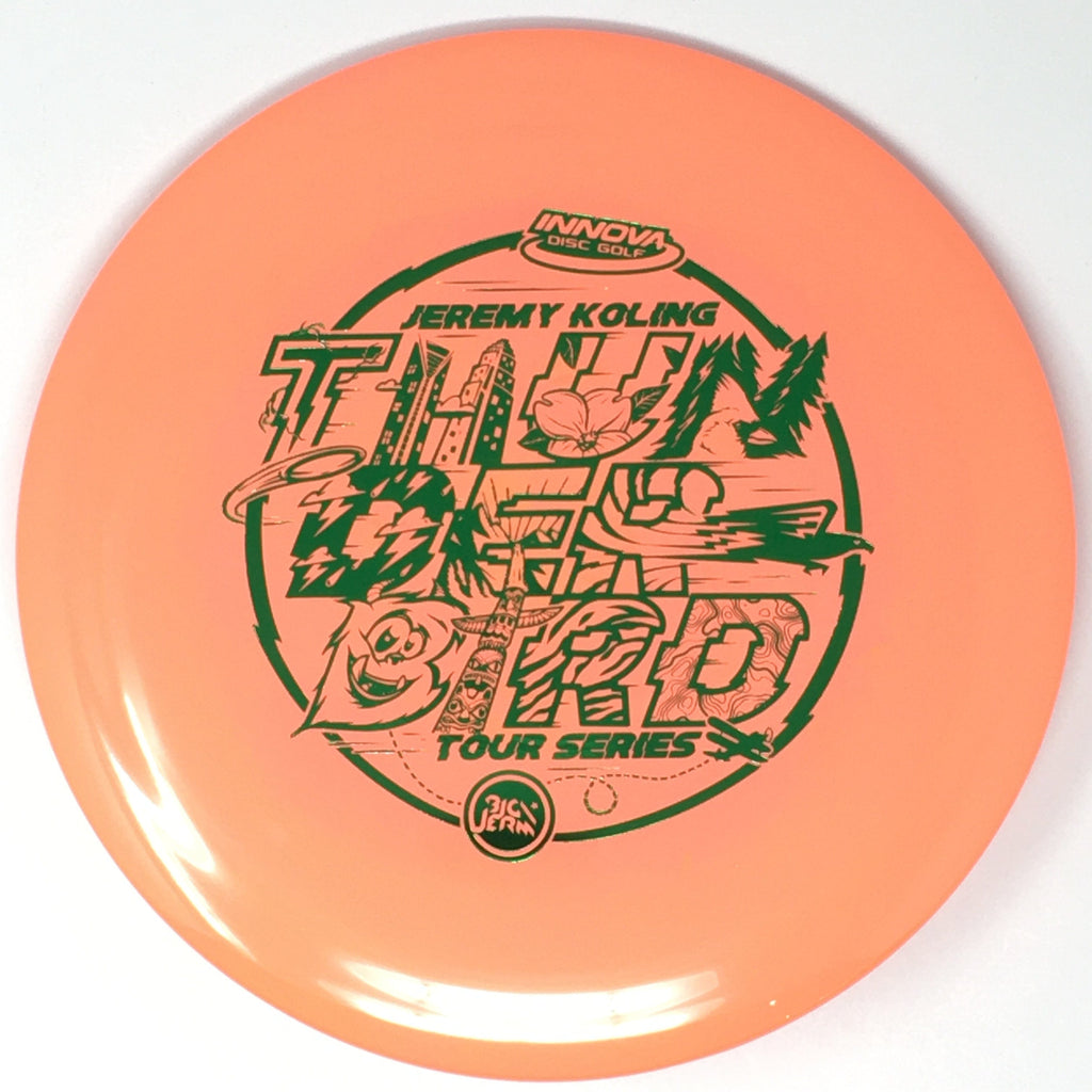
Jeremy Koling 2022 Stamp Background: "As you guys know, the 2022 Thunderbird has officially dropped! You guys are my rocks so I wanted to give you the first look at a real one, it's flatter profile and also explain the backstory of the Thunderbird a bit. Also, I've seen many of your comments so I wanted to explain the art direction.
This disc means everything to me. No clichés, I would NOT be doing what I'm doing if it weren't for this disc. It's the reason Jewels was able to quit her job and go on the road with me. When I joined Innova in 2017 and was offered a spot on the Star Team I knew the swirly star Thunderbird had the potential to be a huge hit. I was so incredibly lucky to have that disc as an option and I could not be more appreciative to Innova for the way they've helped me grow my brand and expand my career in every way imaginable. The choice that I've made to switch up the runs slightly every year hasn't been an accident. I want there to be a tour series Thunderbird for everyone, no matter your disc feel preference, domey, flat, overstable to straight. In my honest opinion every year has produced an absolutely fantastic disc, just for varying preferences. This year I've decided to return to my roots and bring it back to the OG flatter Thundy. I hope you guys love this disc as much as I do and I appreciate all of your support!
On to the art. Being a graphic designer, Innova gives me special privileges in the creation process. About a year and a half ago I got the first draft of a proposed concept of the 21 artwork. It had all the DNA of just about every thunderbird, firebird and any other bird named tour series disc ever made - big bird in the middle, some interesting font and that's about it. Something struck me then that this wasn't for me. I wanted to try something different but I wasn't sure what yet. I just started throwing ideas around until something started to take shape. It took influences from 90s pop culture and mimicked the era that I grew up in. For me, it just felt right to mix it up. I know it wasn't for everyone but I was very proud of the way the 21s came out. It SAID Big Jerm all over it without the appearance of my logo anywhere. The formula seemed to work pretty well so I was encouraged to stretch my imagination once again in the 2022 design process.
The idea behind this year's stamp was to create 11 separate living, breathing, unique environments eventually spelling the word THUNDERBIRD. For each letter to provide its own canvas the word needed to stretch out over 3 lines otherwise the detail within each character couldn't be developed. I wanted to put my home state all over this disc - the two tall buildings that make the H are actual skyscrapers in uptown Charlotte, the U is filled with a dogwood, NC's state flower, the N has both the state bird and the state tree and there's an a little biplane at the bottom, an homage to the paper airplane in the 21 stamp but also to the Wright Brothers and NC being first in flight. Every letter has special meaning. The T and D depict lightning and a storm, which is clearly a reference to discs name. The mountains and waterfall in the E represent one of Jewels' and my favorite pastimes- hiking to as many waterfalls as we can. The first R seemed like an appropriate place for a traditional Thunderbird icon. The B was me just being a silly b**** so I had the art team turn the letter into a fun, whimsical monster. Totem poles and NW native art is where the thunderbird lore comes from so I've tried to incorporate that into as many stamps as possible. The last R has tiger stripes because A - I think tiger stripes are dope and B it is the Chinese year of the tiger. And finally the last D is filled with topographical lines which are probably my all time favorite visual texture and because to me it represents my ambition to travel and explore. I hope that this helps you look into my design brain a bit deeper. You don't have to like the art. If you do, cool, if not, well, cool too. I knew this would be a divisive choice in art direction but in the end I made a clear choice to avoid the ordinary and this is the result! If you do like it, credit Innova's creative team, they did a terrific job taking my ideas and implementing them onto a disc. If you don't like it, I will absorb all blame. Either way, please support the cause and get a couple and try them out. It helps me more than you know!
If you've made it this far, thanks for reading! I appreciate you all!"